
Coffee is the #1 preferred caffeine drink for college students, therefore connecting with the local community and placing group orders would improve the coffee ordering experience with this app.


Problem
New cafes have to promote their business in order to not lose out on potential customers, while busy students need a more efficient way to place multiple coffee orders because inputting orders individually takes too much time and can lead to mistakes.
Solution
An app personalized for Northwestern University students to place and pick up orders from partnering cafes. The app aims to streamline the process of group ordering by accurately showing students their options before they order.
User Interviews
Competitive Audit
Full Competitive Audit Spreadsheet


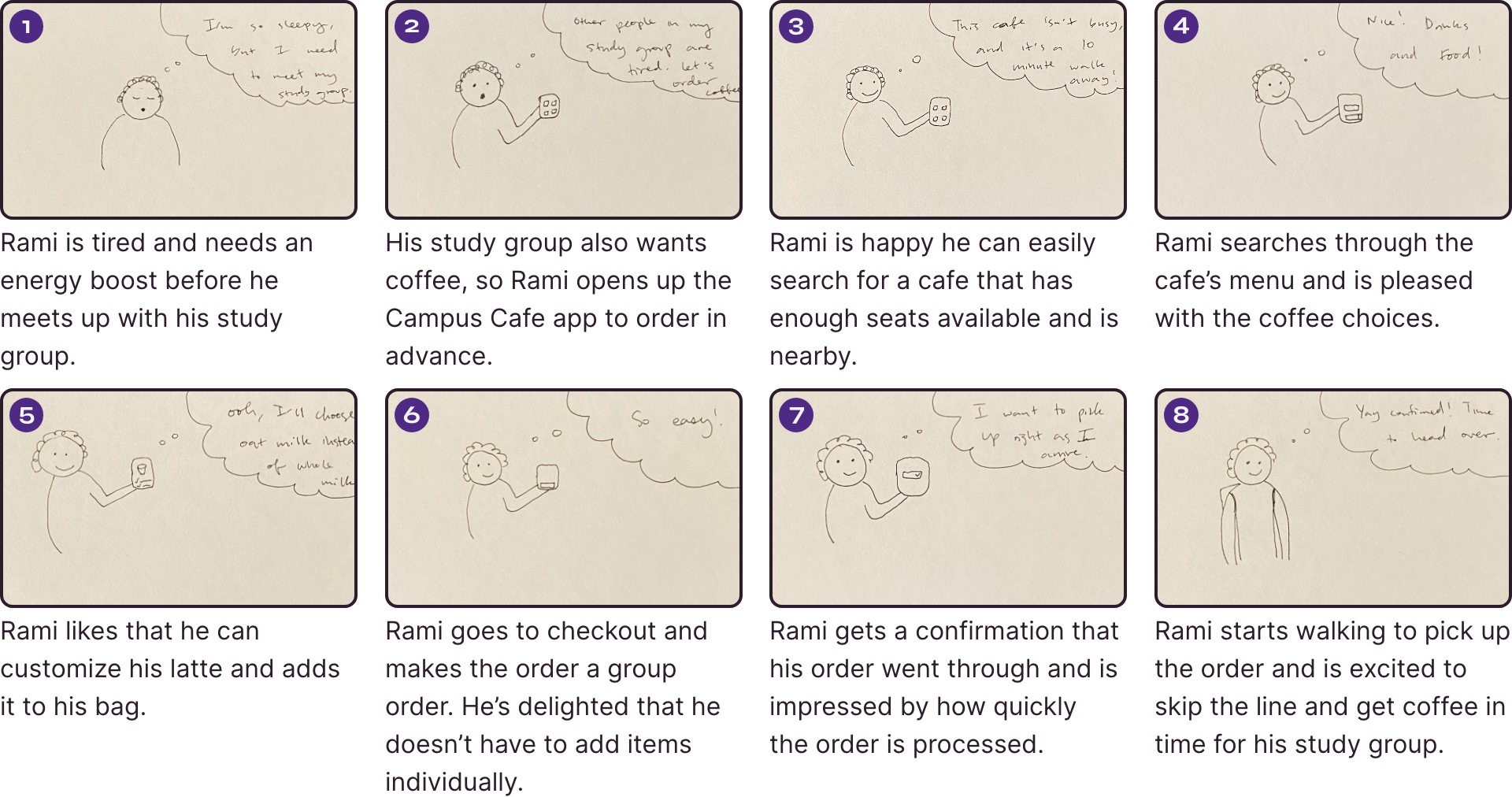
Storyboards

Crazy 8s -> Paper Wireframes -> Digital Wireframes


Design System & Prototype

Usability Testing & Affinity diagram
High-Fidelity Prototype Prompts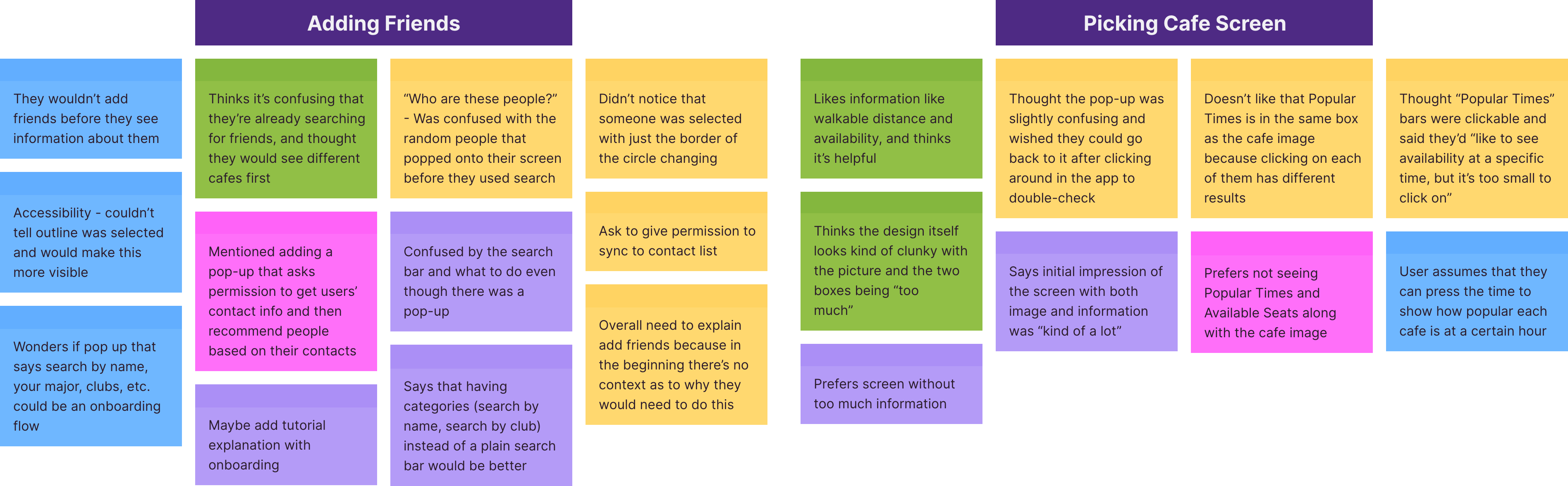


Final Design Changes
Final Design Prompts


Final Takeaways
