Key changes from the high-fidelity prototype to the final design are shown below:
Onboarding & Category Selection
Participants liked being able to preview the app's main components and thought this would make browsing clothing easier later.
Wireframe
Prototype
Final App Design
Changes
- Users didn't realize that they were able to choose multiple choices, so I added a pop-up with instructions
- Concise copy and engaging graphics to boost user engagement and retention
Body Scan Tool
Old Experience
1. Read introduction
2. Read instructions
3. Scan body
4. Review scan
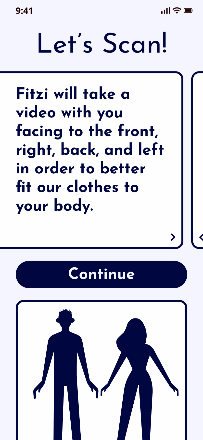
- Users didn’t scroll to the second slide
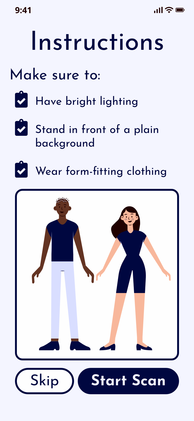
- Users liked the blue color scheme which conveyed security
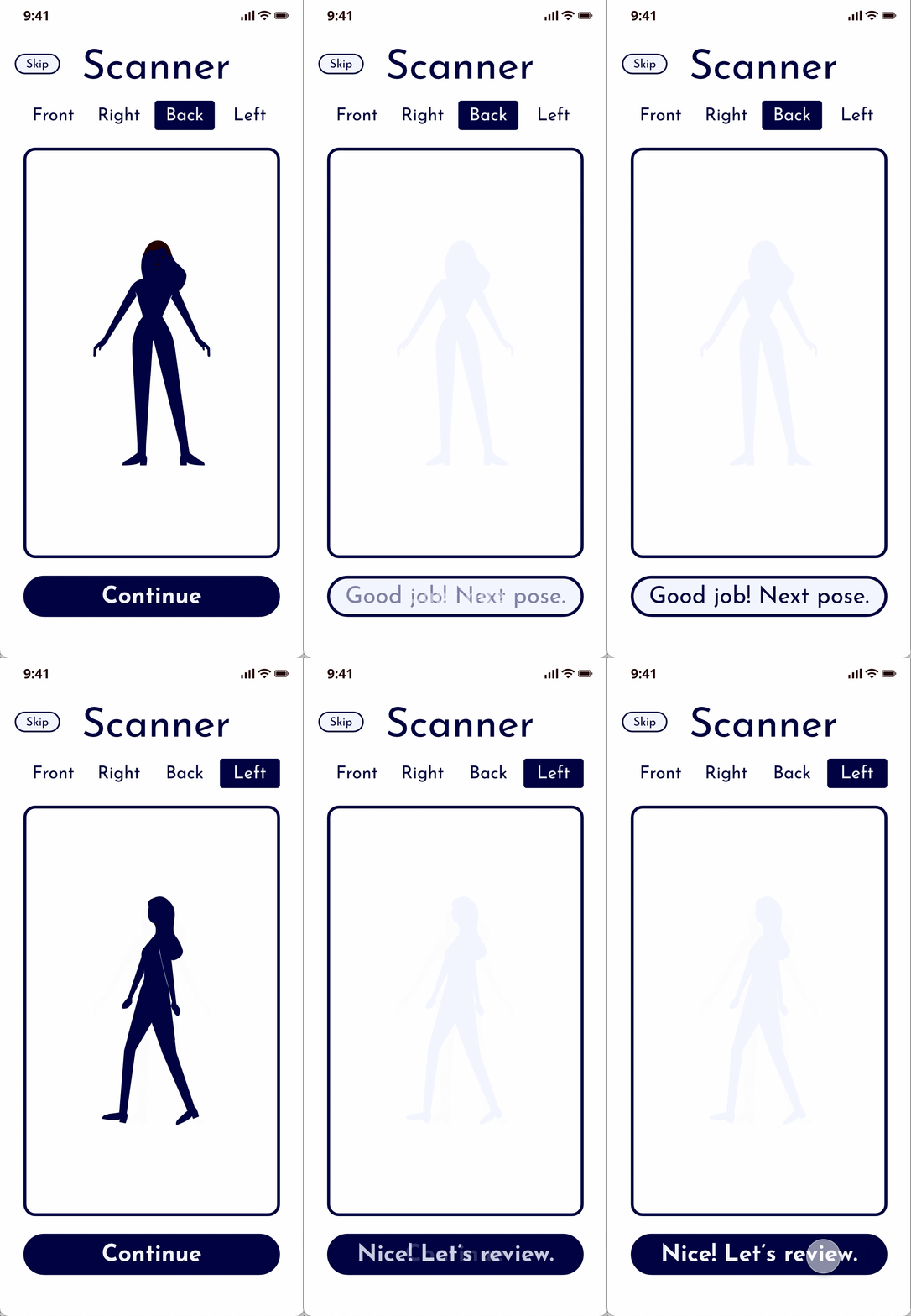
- Users confused by the skip button at this section of the scanner
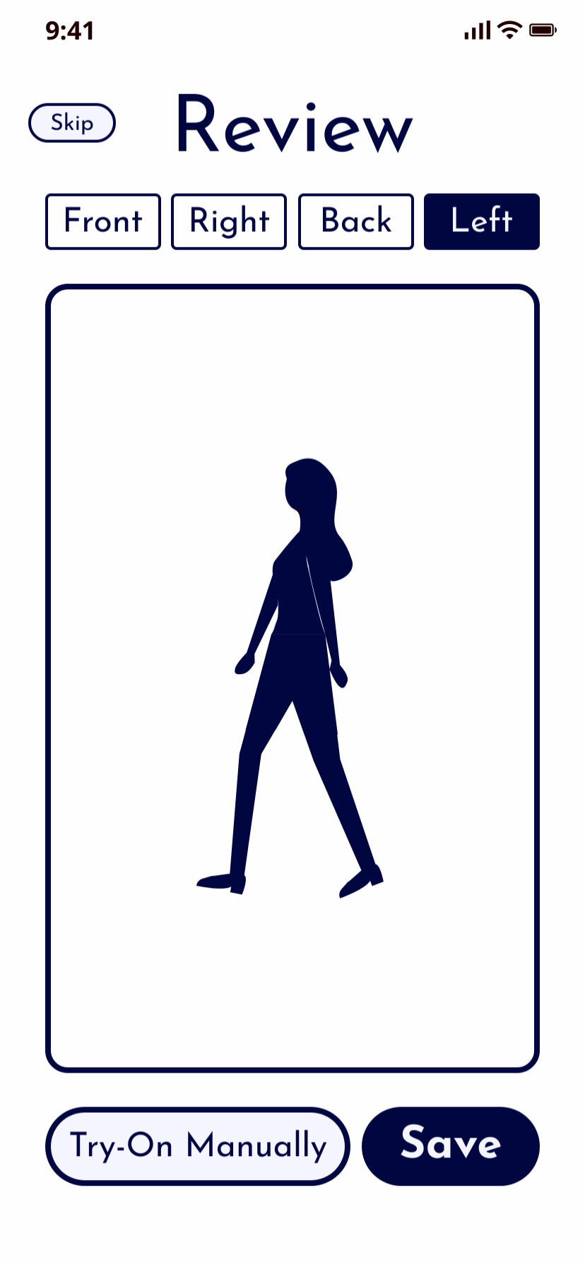
Didn’t scroll to the second slide
Thought that the clipboard icons were clickable
Thought direction labels above scan were clickable
Didn’t understand what “Try-On Manually” meant
- Users didn’t understand “Try-On Manually”
New Experience
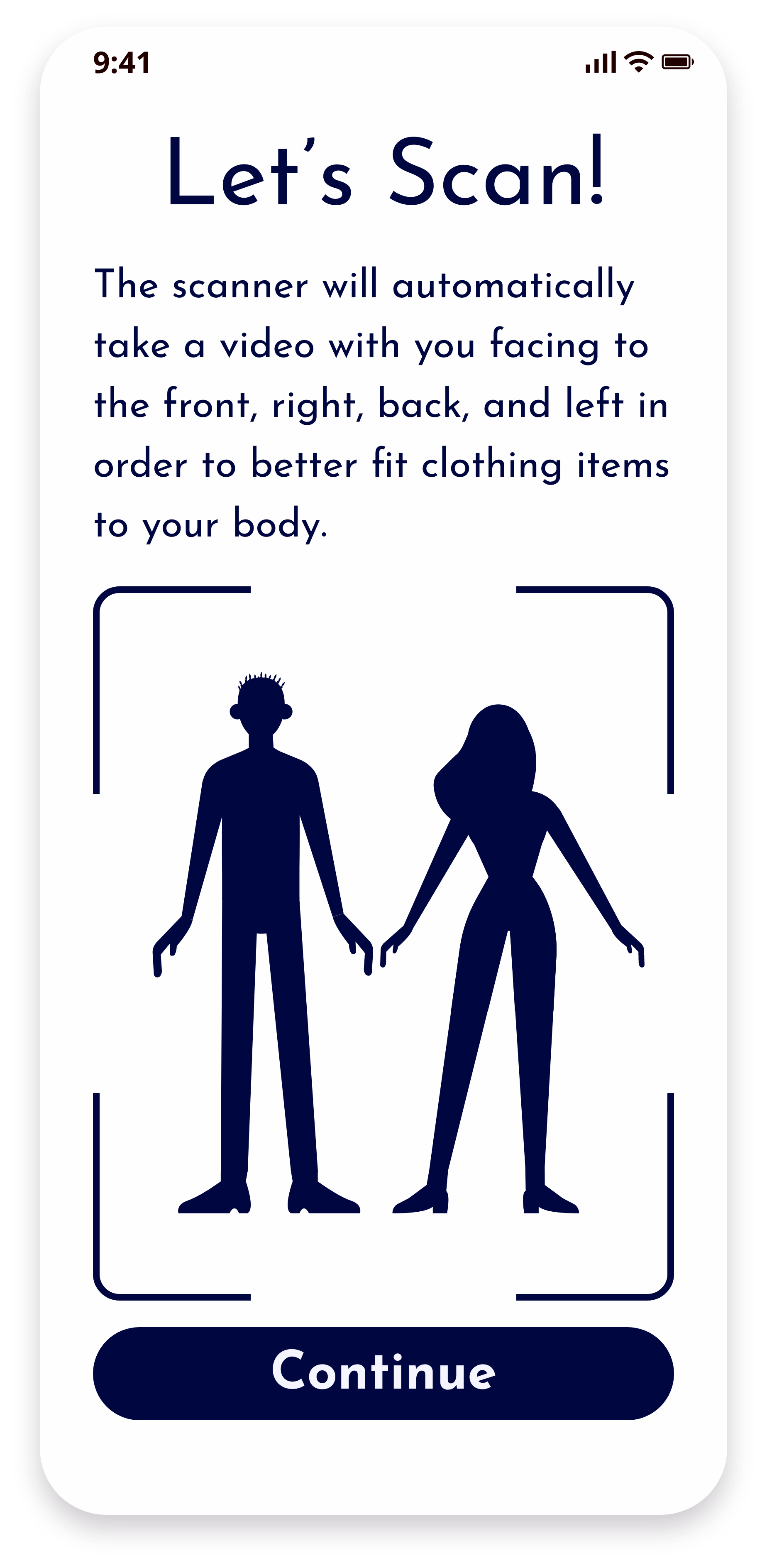
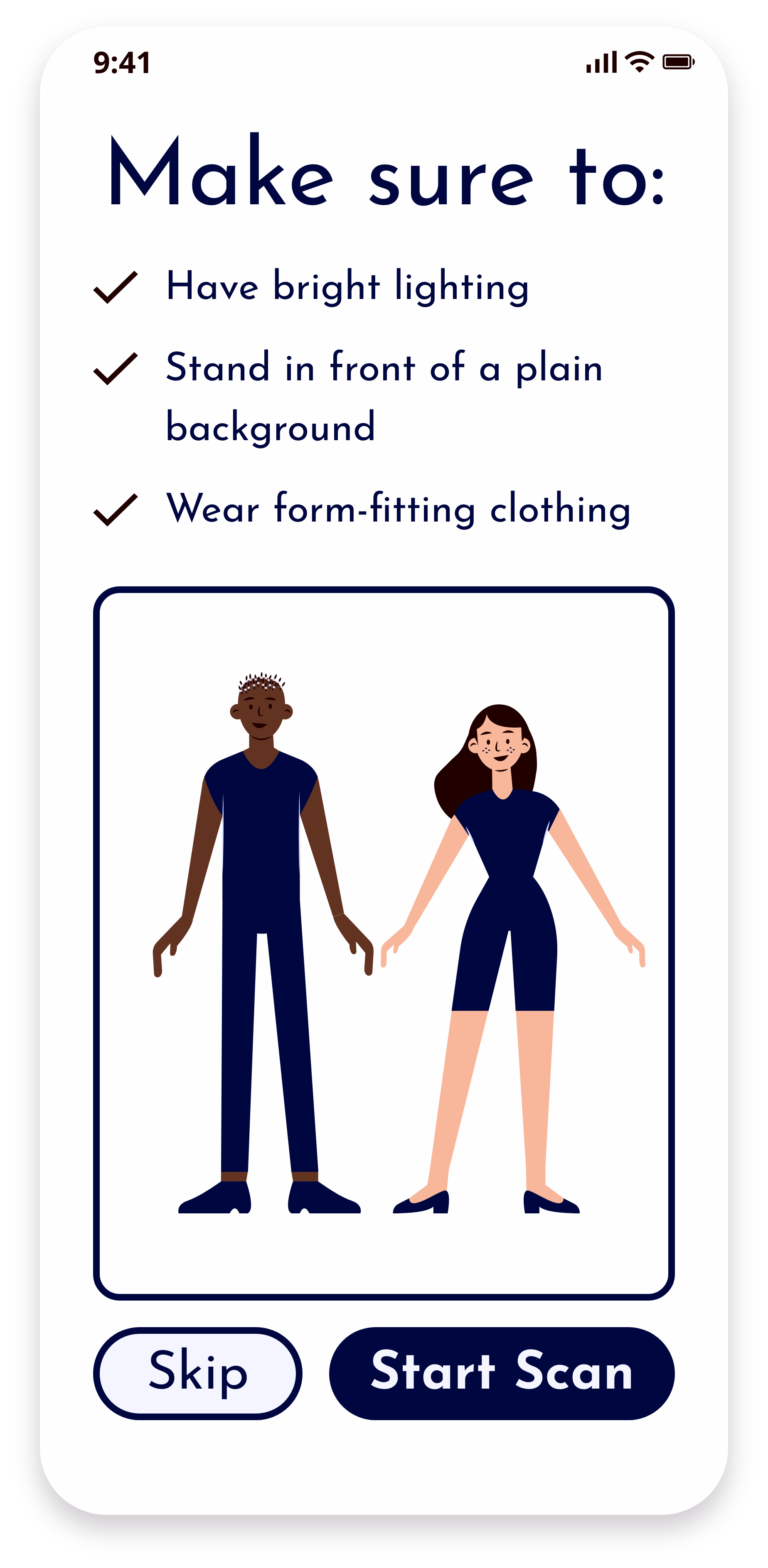
- Criteria was easy to understand - “It’s nice that there are tips and an example image.”
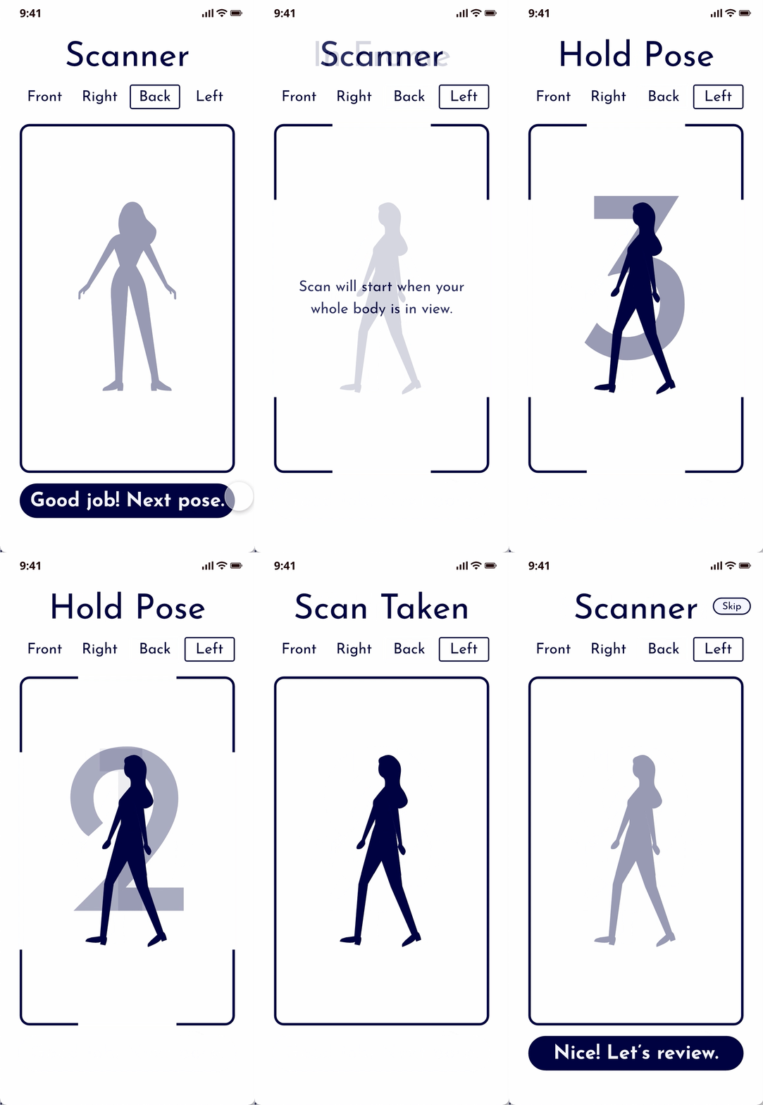
- Kept the skip button on the instructions page, and allowed users to skip the review instead of the scan itself
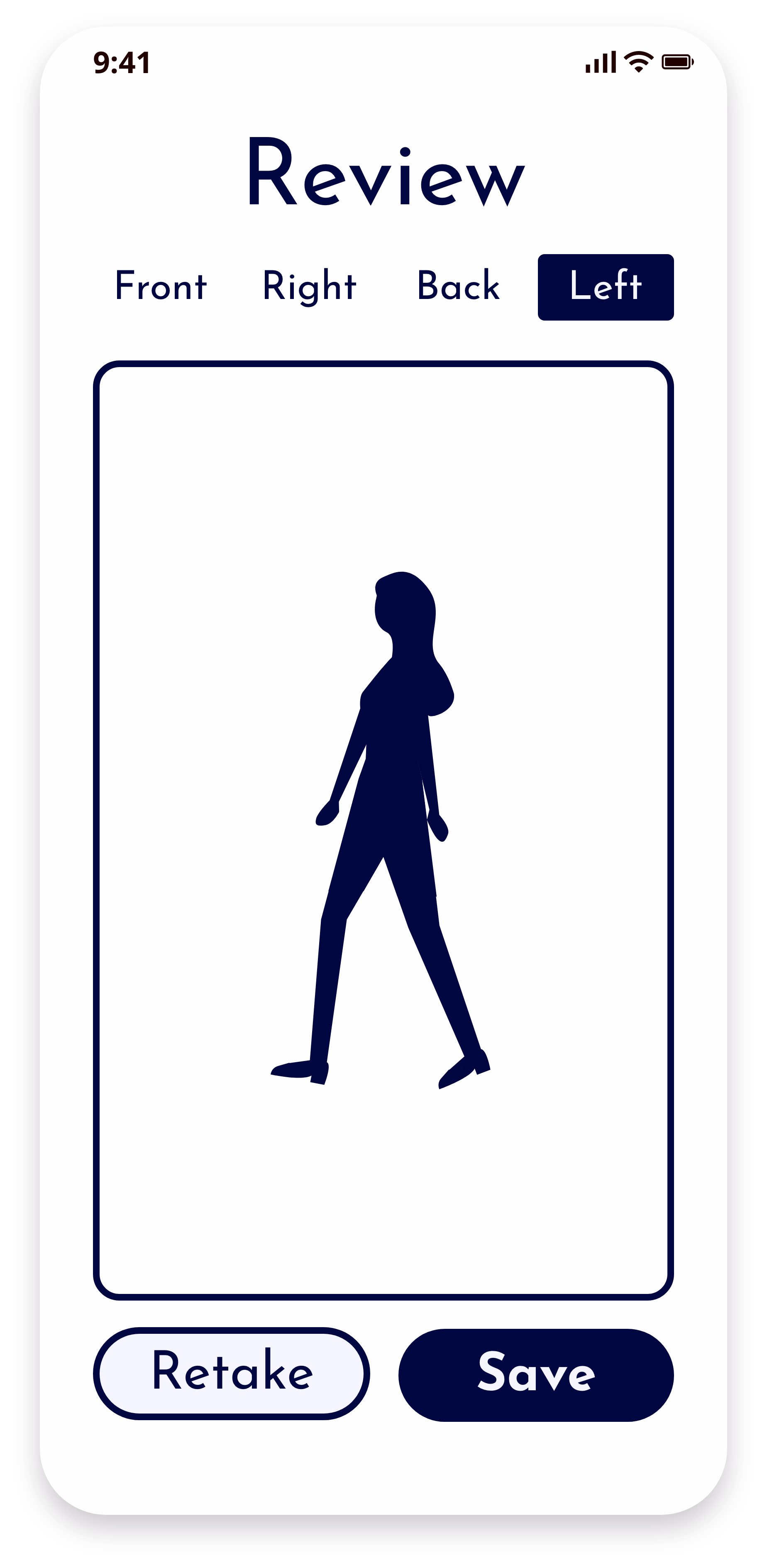
- Changed “Try-On Manually” to “Retake” in case the user isn’t satisfied with their scan
I condensed the description to keep it on one page
Users liked the blue color scheme which conveyed security and said the criteria was easy to understand - “It’s nice that there are tips and an example image.”
Adding phrases for each phase of the scanner to show what part of the scan the user is on with a countdown so the user is prepared to hold still when having the scan taken, then letting the user control switching to another pose by clicking a button
Removing outlines on directions the users weren’t facing in order to not imply interactivity, and I changed "Try-On Manually" to “Retake” in case the user isn’t satisfied with their scan
Clothing Page
Participants were most confused about the door icon because they thought clicking on the door icon would open to an individual product page rather than clicking on the entire product photo. They also thought that the numbers that replaced the door icon equated to the quantity of that item rather than the total number of items added to their Fitzi Room.
Wireframe
Prototype
Final App Design
Changes
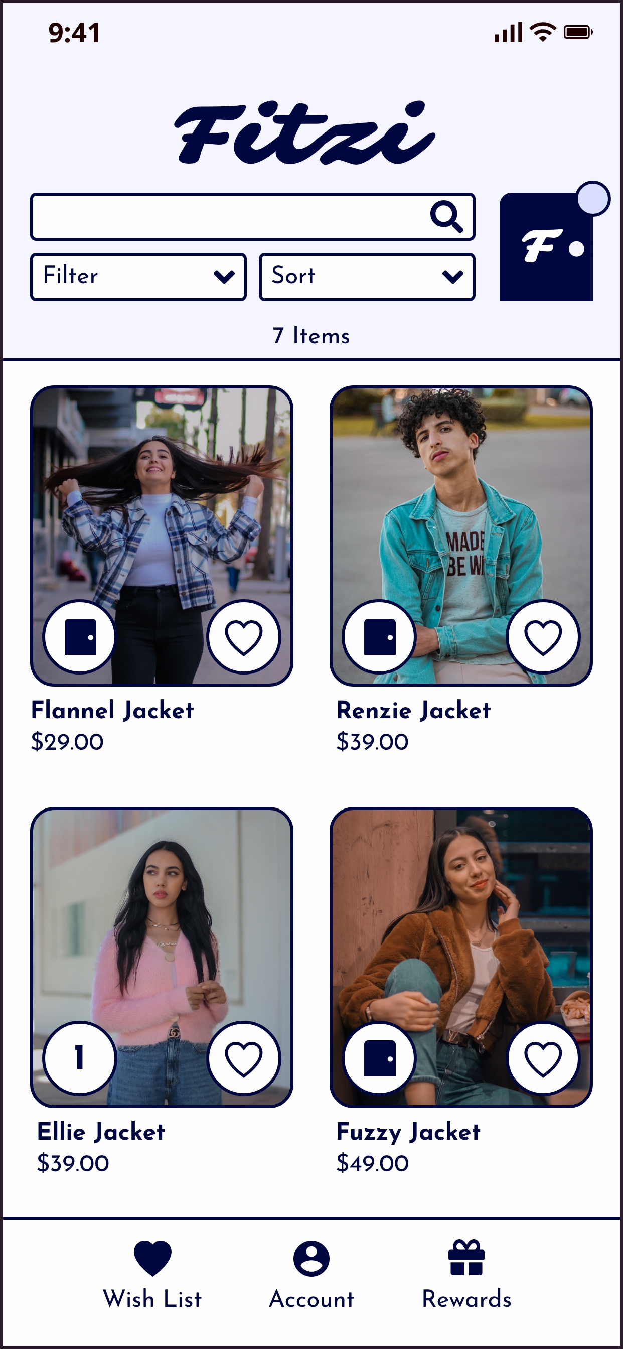
- Labeled the FItzi Room icon so that users wouldn't confuse it with their cart
- Users didn't understand the door icon meant that they were adding that item to their Fitzi Room, so I changed it to a plus
- Added Fitzi Room and Cart icons to the nav bar so users are able to see that these are two different actions and have better access to their bag when selecting more clothing items
Wireframe
Prototype
Final App Design
Changes
.jpg)
- Made button inactive after user adds an item to their Fitzi Room
- Added tabs with a small blurb on how each icon relates to the clothing item
Fitzi Room
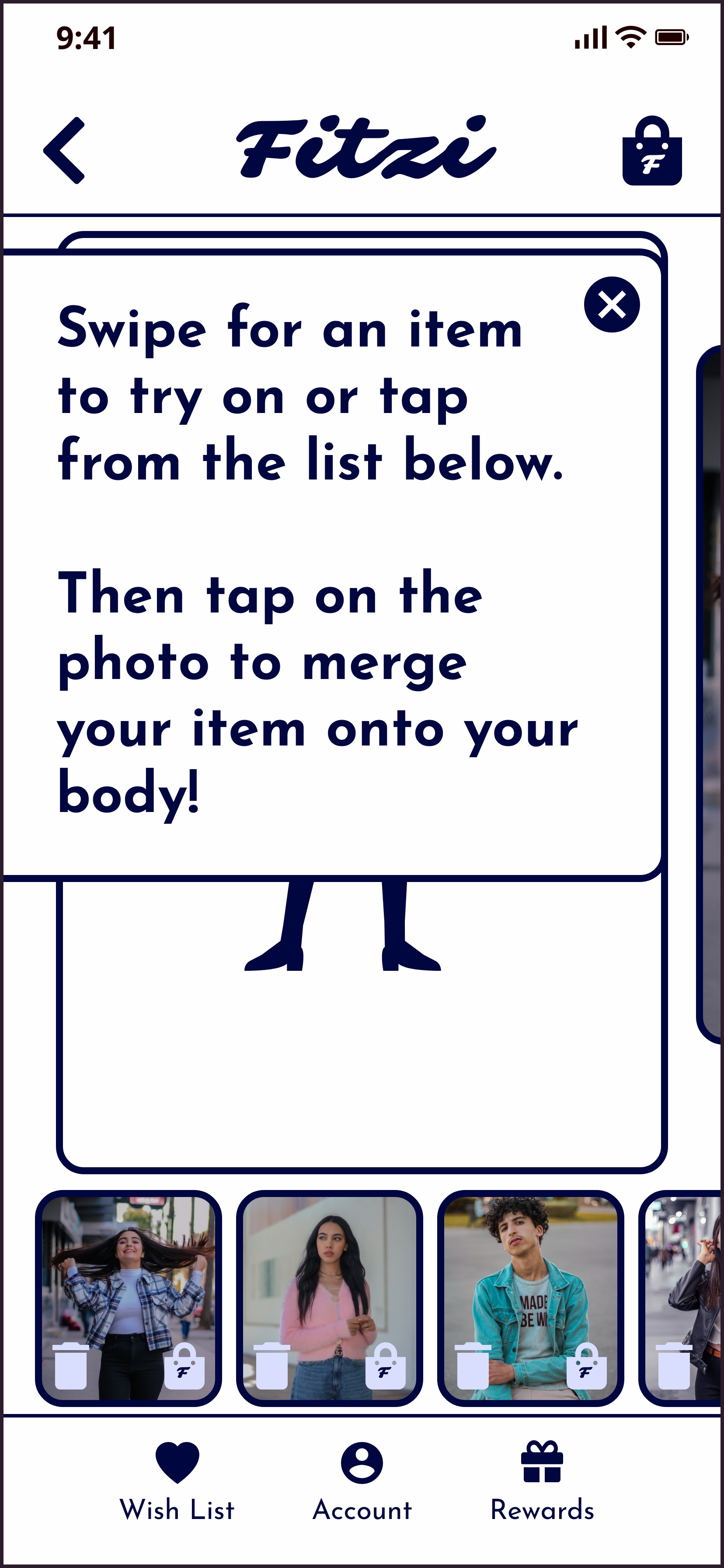
Users forgot the instructions after they were closed and already assumed clothes were on their bodies, so both the instructions and the merge function were unnecessary.
Wireframe
Prototype
Final App Design
Changes

- More dynamic instructions instead of a pop-up
- Added larger Trash & Bag icons to the top main view because users had a hard time clicking on the icons at the bottom of the screen
- Tapping on the bottom product photo opens a pop-up where users can view product information and edit the item without having to go back to the clothing page


.jpg)


